

Understanding Colour
Why What You See Isn’t Always What You Get
imuniqueUK (often styled as iUk) — Colour guidance for sublimation transfers, DTF, and DIY HTV projects.
Ever ordered something that looked perfect on your screen, but the colour arrived a little “off”? Therefore welcome to the wonderfully unpredictable world of colour. This easy read explains why colours look different on our screens, and how RGB and CMYK work, and how to set realistic expectations for your prints.
The Basics: Reflected Light vs. Self-Illumination
Here’s the first key to understanding colour: not all colour is created the same way. When you hold a bright red apple under the sun, you’re seeing reflected light — the surface reflects certain wavelengths and absorbs others. Now look at that same apple on your phone, in contrast you will see your display uses self-illumination, mixing tiny red, green and blue lights to emit the colour straight at your eyes.
One system bounces light off a surface. The other beams light at you. Two different engines; two different outcomes.
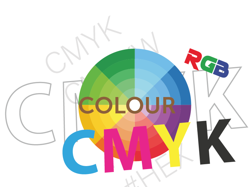
The Colour Codes of Our World: RGB and CMYK
What is RGB?
RGB stands for Red, Green, Blue; The primaries of light used by screens. Therefore by adjusting how much of each is emitted, displays create millions of colours. 100% of all three gives white; 0% gives black; everything in between is your glowing rainbow. RGB is perfect for digital, backlit brightness.
What is CMYK?
CMYK stands for Cyan, Magenta, Yellow and Key (Black), the inks used in industrial printing. Instead of adding light, inks subtract it: each layer absorbs some wavelengths and reflects the rest. CMYK is how your iUk sublimation transfers, DTF prints appear on real materials.
Where the RGB vs CMYK Clash Happens
RGB and CMYK speak different languages, RGB says, “let’s make this as bright as possible!” CMYK replies, “I’ll do my best — but I’m working with ink, not light.” Because screens can display a wider range (gamut), some vivid RGB colours don’t exist in CMYK. That electric blue may print more turquoise; that hot pink may look softer.
The Role of Calibration: Why Screens Disagree
Your screen, your friend’s screen and our production monitor can all show the same file differently. That is down to “screen calibration”. Brightness, contrast and colour temperature vary between devices (and age matters too).Unless displays are tuned to a shared standard, each interprets colour in its own way.
Simple take: Think of several people singing the same song in slightly different keys. It’s recognisable, but the harmony shifts.
Why “Colours May Vary” Isn’t a Cop-Out
At iUk, we know “colours may vary depending on your device” can sound like a shrug. It’s actually an honest reflection of how colour behaves. You’re viewing designs in RGB light, while we print using CMYK inks on materials that absorb and reflect light differently. Add calibration differences and it’s normal for subtle shifts to appear.
A Handy Analogy: Colour Is Like Cooking
You can follow a recipe exactly, but your oven runs a little hotter, your tomatoes are a touch sweeter and your lighting is different. The dish tastes great — just not identical to the photo. Colour works the same way: the recipe (your file) meets the realities of screens, inks and surfaces.
Tips for Your Best Possible Match
- Lower screen brightness — most displays are brighter than any print can be.
- Avoid ultra-saturated “neon” colours — many are outside CMYK’s printable range.
- Provide colour values — consistent CMYK or Pantone targets improve predictability.
- Request a small test print if your project is colour-critical.
We’re always happy to help you navigate colour — it’s part of the creative journey at imuniqueUK.
Wrapping Up: Colour Is Both Science and Art
Colour bends with light, shifts with ink and changes with every screen and surface. Understanding reflected vs self-illuminated light, RGB vs CMYK and calibration helps
set realistic expectations when your stunning digital design becomes a real-world print.
At imuniqueUK, we celebrate that uniqueness, it’s in our name and that is where iUk shines.
Frequently Asked Questions
Screens use glowing RGB light, while prints rely on CMYK inks reflecting light. Add differences in screen brightness and calibration, and small colour shifts are perfectly normal.
Yes! Lower brightness and avoid vivid display modes. Professional calibration tools can align your screen more closely with print standards, but even then, light-based colours will always appear brighter.
Neon and electric tones exist only in RGB’s light spectrum. CMYK inks can’t reproduce that same luminosity, so they appear softer or less intense in print.
Share colour values, keep designs within CMYK range, and request a small sample if your project depends on precise shades. The iUk team will always do our best to match colours faithfully within print’s natural limits.